Friday 24 October 2014

Class Project: Contents Page

Contents Page:

Our next task was to create a contents page for our magazine. The following screenshots show the progress of my contents page as it was being created. To begin I put the pictures on the side of the page and added frames around the images which matched the colours used on the front cover. I used the same colour on the font for 'contents' to continue the theme. 

Originally I used capitals to write 'contents' but the font did not look as bold as I'd it to, so I added a grey box behind the writing and changed the font style. This made better use of the space on the page and helped to cooperate more of the colours used on on the layout. 


I added the subtitles for the contents page next, this was arranged by 'featured stories', 'regulars' and 'groups'. 


This is my final contents page. I added page numbers and features for main stories. To improve I would add more images, text and create a better background to improve the overall aesthetic. 

Wednesday 22 October 2014

Sound Recreaton

Sound Recreation Lesson:

Our task was to choose a silent clip from either The Shining, Luther or Sherlock. The clip I am analysing is from The Shining 'Here's Johnny!' scene which was recreated by Scarlet and Rebecca (video begins at 2:12). 


The original clip begins with high pitched screeching which foreshadows that the female character is in danger. In the recreation there was an instrumental used to create a non diegetic impression of tension and suspense. This is followed by the ambient sound of weather and cricket noises and a small child's cry; whereas in the original clip, the woman is whimpering because she can't get out. The sound in the recreation successfully conveys the extreme weather and how uncomfortable the situation is, conveying that she is trapped. 


The voice featured in the original clip sounds intimidating and in the recreation there is also an intimidating voice besides the obvious difference in pitch. Both videos end with the banging of the axe against the door and the woman screaming, however in the recreation the sound is more a pronounced cry. 

Class Project: School Magazine


Ambition Magazine:

Our task was to create a school magazine. This is my front cover. I chose the masthead 'Ambition' as it is a word which applies to my audience of students (aged 15-19). The colours behind the coverlines were used to replicate the effect of highlighters being used, likewise the font used looks like writing on a typerwriter so that it is clear to read. Whereas the other fonts appeared less clear and too bold. Overall, this develops the theme of the magazine fitting in with student life. 

Other fonts I considered were: 


If I had more time I would improve the image quality to improve the overall aesthetic of the layout, as at the moment the colours appear very bright which appears amateurish. 

Wednesday 8 October 2014

Possible Masthead Fonts


These fonts are all possible mastheads for our class project to create a school magazine. My favourite one is the 'Ambition' design, so I will continue to research fonts and other designs based on this word for my final magazine cover. This is my favourite because I think the font looks simple but bold therefore it should look good above my main image.. 


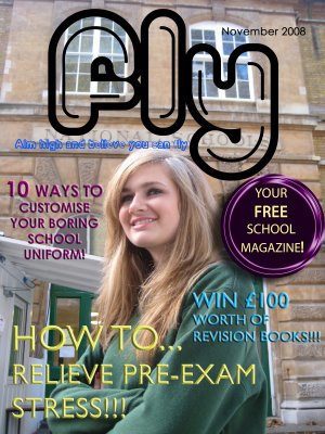
These are examples of school magazines created by other media students. Both feature bright colours, and feature coverlines based on exam stress and topics such as uniform. When I create my own magazine I will have to consider topics which apply to my audience (students aged 15-19). For example if I write about school uniforms and sixth formers are my target audience, this topic becomes irrelevant.


Wednesday 1 October 2014

Magazine cover photoshoot


This photoshoot is for our class project to create a school magazine. All images are unedited, but at the moment my favourites are the library picture, the picture outside holding the folder and the bench photo. 

Esquire Magazine Cover Remake


Megan Fox for Esquire Remake:

Our task was to recreate the Esquire cover (pictured first), by using the beginners starter pack (the second image). The last image is my version of the magazine cover. If I had more time I would add the additional text and cover lines then finish the layout.